Crafting an icon in 4 simple steps
To convey a consistent brand story, designers must craft icons that are visually sound and meaningful to the viewer. Developing a strong icon library streamlines the branding process by establishing a bank of content from which to draw. This makes it easy to incorporate icons as part of a larger design system. Follow the four steps of designing an icon (in this case, a cat) to start to build a purr-fectly uniform icon library for your brand.

Step 1: Always start with a grid.
Icon grids act as a foundation for your design work. Grids help to maintain a standard size across all icons, and ensure that everything is evenly spaced and aligned properly. The grid also acts as a defined border to ensure the icon isn’t cramped within the space, and keeps the dimensions consistent when scaling the icon for different uses. When creating an icon library, a standardized grid will also speed up the design process.
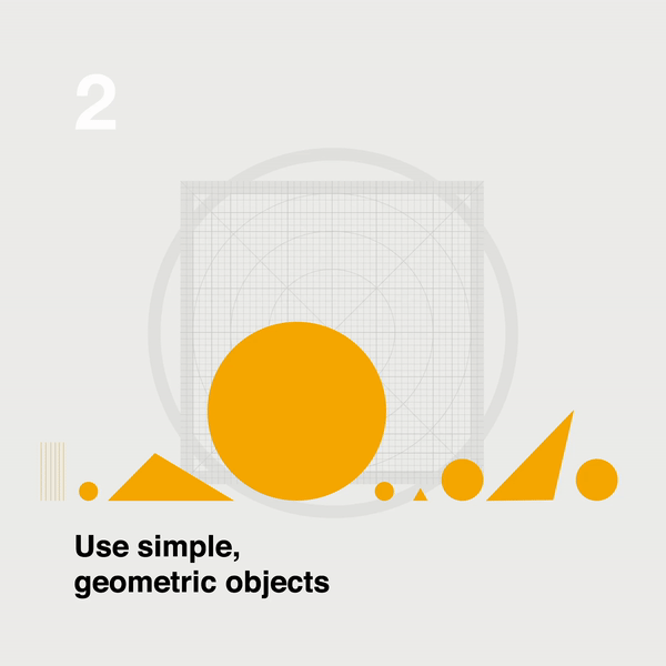
Step 2: Use simple, geometric objects.
The most effective icons use simple, geometric shapes as a base, including circles, rectangles, triangles, and squares. Rather than free-drawing, these prescribed geometries will simplify the icon and result in a cleaner final product. Before designing, think about which shapes fit together best to form your icon and which of these shapes make it identifiable. Above, the base of the cat icon is created using only circles and triangles.
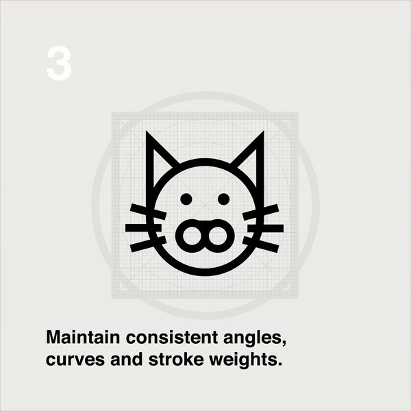
Step 3: Maintain consistent angles, curves and stroke weights.
Once the basic geometric shapes are in place, it’s time to add angles, curves, and stroke weights. When adding to shapes, it’s important to be consistent. Drawing freehand will result in imperfections that interfere with the icon’s clarity. Most icons use 45-degree angles with a rounded-corner value of two pixels, and a stroke size of two or four pixels. Uniformity is vital, as even slight inconsistencies will be noticeable to the human eye.
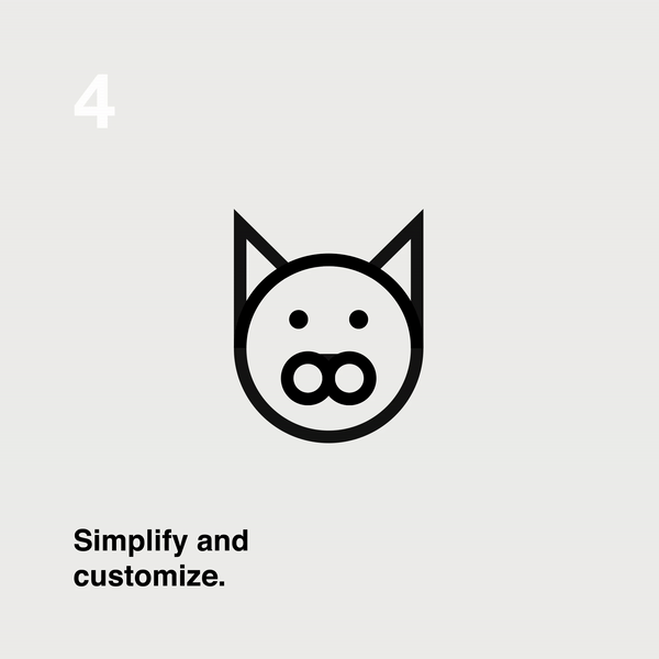
Step 4: Simplify and customize.
Only use as much detail as necessary to convey the icon’s meaning, while still crafting a unique look that fits within the brand characteristics. If you will be scaling the icon for different uses, consider how much detail you’ll want to retain its recognizability at smaller sizes. To tie the entire library together, designers often carry one specific design accent through all of their icons, such as the three whisker spots on each side of the cat’s face.

And there you have it—a paw-some icon to add to your library! Keep it simple, but remember that rules are made to be broken every once in a while. Adding your own personal flair will take an icon from great to outstanding.