Paws for impact: putting pets and purpose first
Creating an engaging CSR report for a major brand requires strategic thinking, creativity and a commitment to representing its values in visually dynamic ways. And that was exactly the approach we took when designing PetSmart’s latest CSR report, which highlighted their inclusive approach to pet care and animal welfare. Here are just a few ways we made PetSmart’s mission and values come alive on every page.
Reflecting empathy and inclusivity
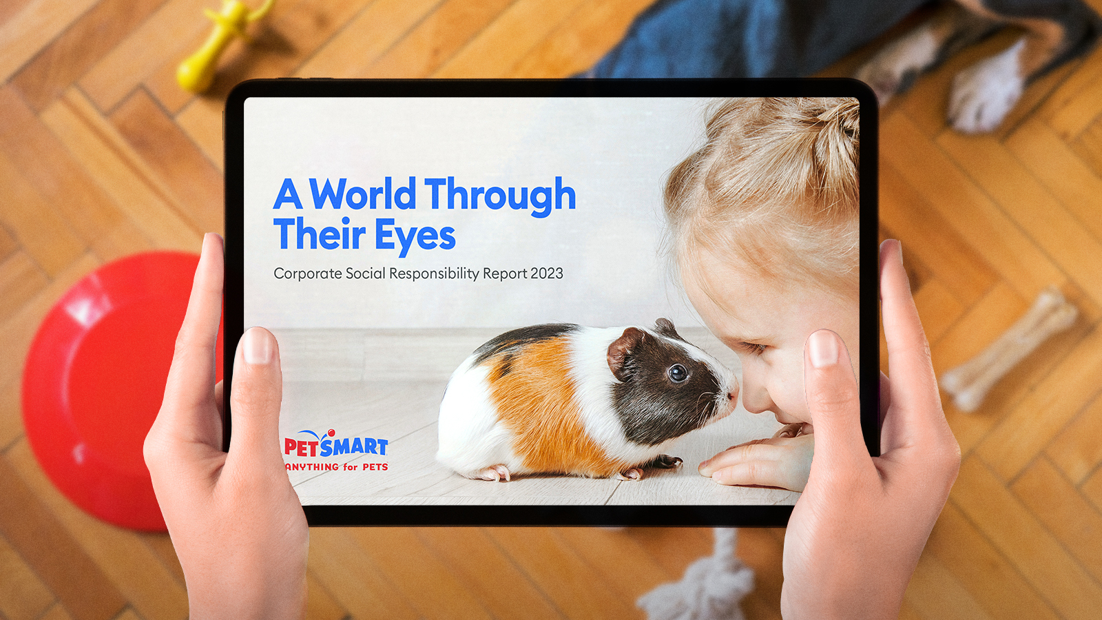
To convey PetSmart’s compassionate vision, we centered the design of the report around their CSR platform, A World Through Their Eyes. This concept shined a spotlight on a range of pets, symbolizing the diversity and inclusivity PetSmart is fostering. Through strategic design, we used specific visuals to highlight important messages, allowing the mission to lead.
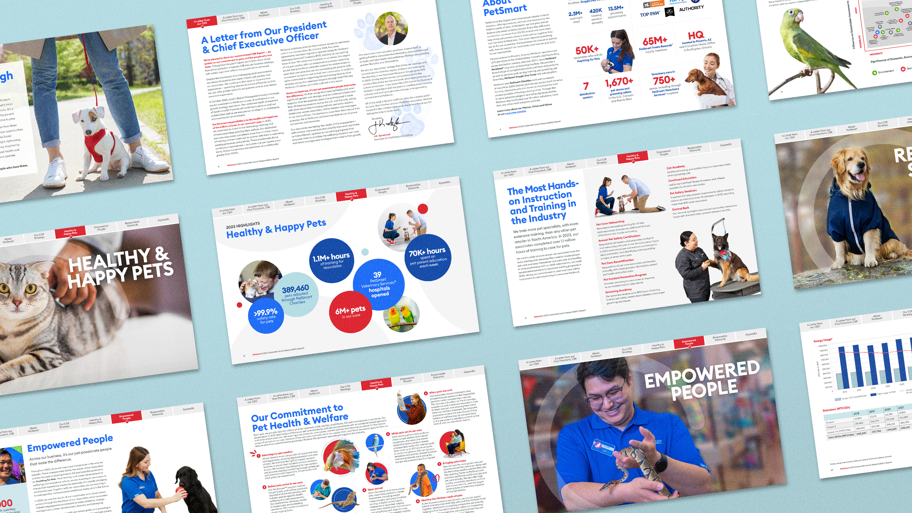
In some sections, design took a quieter role, letting the key messages speak for themselves. In others, it added a vibrant backdrop for complex data, transforming numbers into easily digestible visuals. A cohesive thematic approach allowed us to blend these elements into a seamless experience, engaging readers while reflecting PetSmart’s vision of inclusivity.

Creating ownable design elements
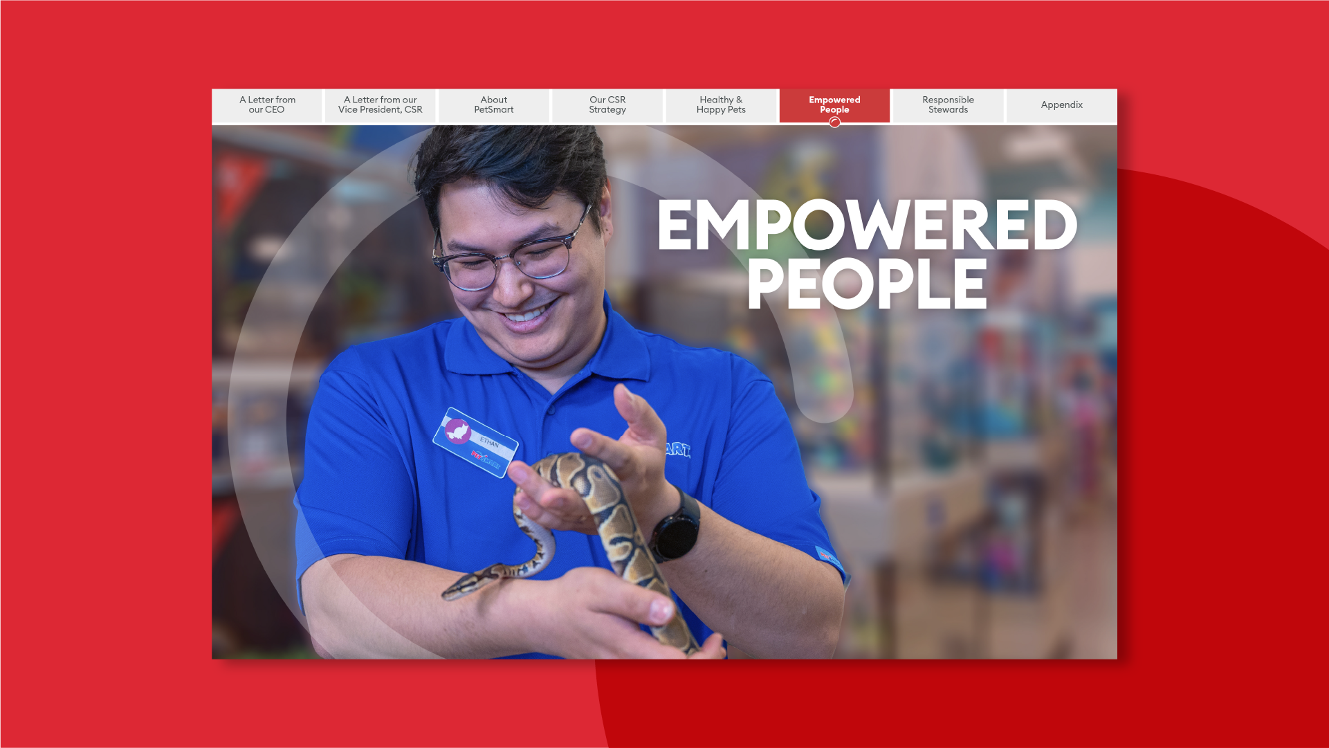
For the 2023 CSR report, we had the unique advantage of building on our design of the 2022 report while introducing fresh, signature motifs that embodied the year’s focus. This involved adding diversity to PetSmart’s visual library, incorporating images of exotic pets, authentic interactions and philanthropy in action to convey a broadened, inclusive view of the world of pet care.
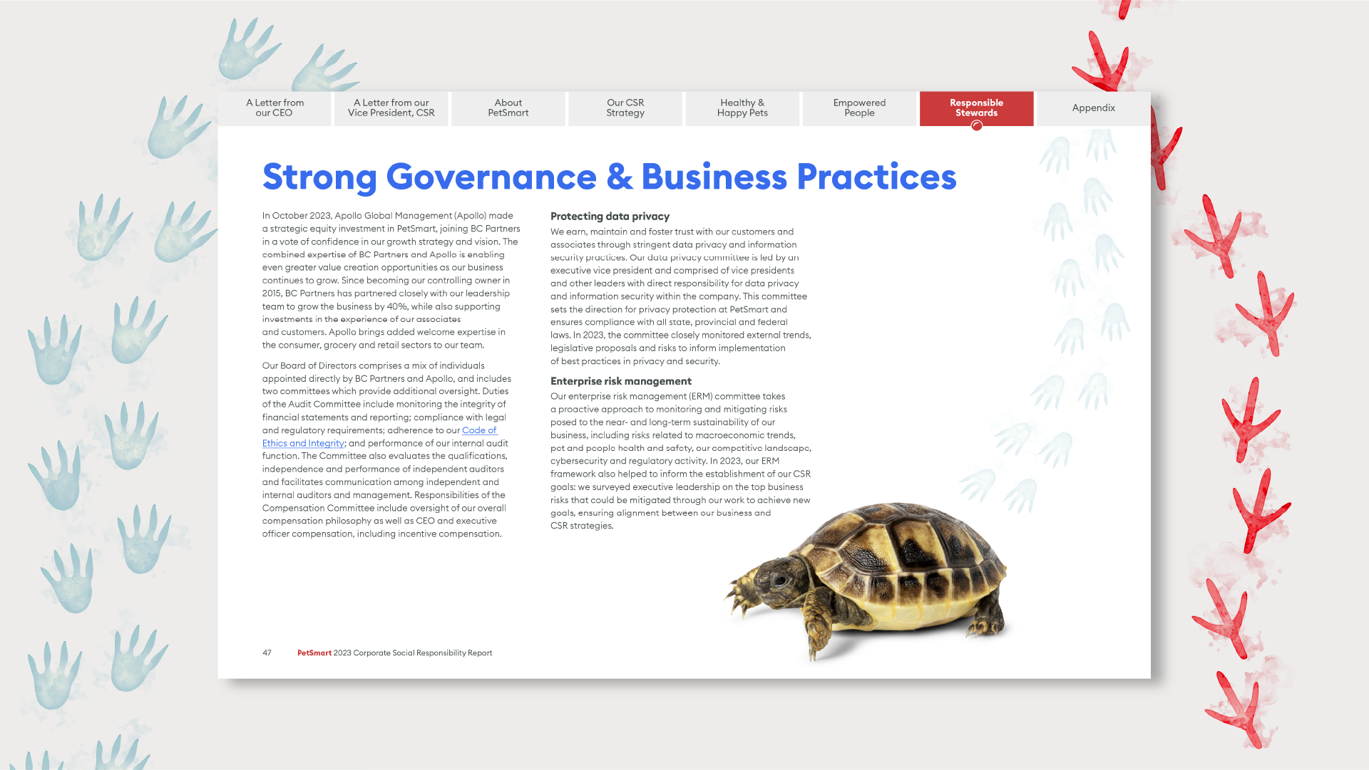
We further enhanced this collection with custom-designed animal pawprints to subtly accent content, echoing PetSmart’s commitment to diversity. These motifs were more than decorative—they served as reminders of PetSmart’s inclusive approach. This balance between familiarity and innovation helped us produce a report that felt both on-brand and fresh, ensuring it resonated with readers.

Prioritizing accessibility and ease of navigation
To make the CSR report a practical, easy-to-navigate resource, we carried forward some user-friendly design elements from the 2022 report, like a progress bar that guided readers through different sections. We revamped it to feature PetSmart’s iconic red bouncing ball, making navigation intuitive and unmistakably on-brand.
Beyond navigation, we also elevated readability by using PetSmart’s sans-serif font, Euclid, and incorporating familiar circular brand shapes as visual markers. These containers served as signposts, which made the report feel organized and easy to scan. Together, these features simplified the experience, and helped readers get the most from the report whether they were quickly skimming or diving deeper into each section.
Our design strategy for PetSmart’s CSR report helped craft a visually engaging, easy-to-read and cohesive narrative that amplified their mission. Through design choices that reflected empathy, created unique brand elements and enhanced accessibility, we uncovered a way of CSR reporting that inspires action and reflects a brand’s core values—one paw, err page, at a time.

