What’s the story behind new (or shall we say old) aesthetics that have made their way onto the design scene? We gathered for a teamwide luncheon to talk design trends over dishy treats from Providence Bagel. Here are a few of our favorites!
Brutalism
Where it came from: A no-frills style of architecture with smooth, bold and geometric lines, Brutalism represents the 1950’s concept that structural components should be made visible in design. In fact, the term Brutalism is actually derived from the French phrase “béton burt,” which means raw concrete.
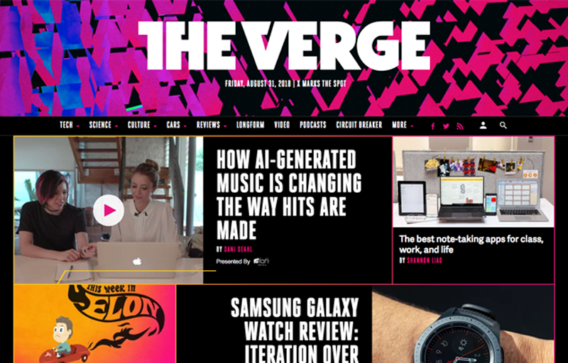
What it looks like: Raw html files, minimal typography, clashing composition – the seemingly unintentional effort behind Brutalism is exactly what makes it an intentional effort.
Where you’ll see it: On your tablet, on your TV or even in your closet, our favorite brands include Bloomberg, MTV and Vans.
Why we love it: Brutalism is different in that it’s an anti-aesthetic aesthetic. It focuses on the bare minimum of design and leaves no room for the unnecessary.

Memphis
Where it came from: Reminiscent of the 1980s, Memphis originated not from Elvis Presley’s hometown as the name suggests, but from the Memphis Group – a collaborative design group led by Italian architect Ettore Sottsass. The style drew inspiration from radical design in Italy, which resisted all norms of modern design.
What it looks like: Bold colors, solid lines, random geometric patterns, layered shapes – this aesthetic resembles the wardrobe of the Saved by the Bell cast and has definitely made its way into the digital age.
Where you’ll see it: Not every brand can pull off Memphis design, but we’re impressed by the ones that do. Our favorite examples include Facebook, Urban Outfitters and society6.
Why we love it: Memphis brings an obvious element of fun to design through its focus on contrasting patterns and colors, and we love that it doesn’t limit itself to just one medium.

Vaporwave
Where it came from: A microgenre of electronic music that emerged in the early 2010s, Vaporwave is defined by its chopped and screwed appropriation of smooth jazz, elevator music, R&B and lounge tunes that debuted in the 1980s and 1990s.
What it looks like: With nostalgic pop-culture references and old-school visuals, this new-meets-old aesthetic features everything from Windows 95 operating systems and Microsoft Word Art to Roman statues and Arizona Iced Tea labels.
Where you’ll see it: Album artwork, music videos, smartphone commercials, Vaporwave is everywhere. But be warned! You may feel the urge to pull out your favorite Lisa Frank paraphernalia after spotting this trend.
Why we love it: Vaporwave brings a sense of nostalgia to design aesthetics with the use of VHS tapes, colors and heavy synthesizer music, leaving us reminiscent of our pre-DVD, Bluetooth and Netflix days.
