Exploring the Fibonacci Sequence: How math and design come together
The Fibonacci sequence is a fascinating mathematical principle that has captured the imaginations of mathematicians, scientists, and artists for centuries. The unique mathematical properties and connection to the Golden Ratio, explained below, can be applied in a number of ways within both math and design.
The sequence is a series of integers that follows the rule that each number is equal to the sum of the preceding two numbers. It starts with a zero, followed by a series of steadily increasing numbers – 0, 1, 1, 2, 3, 5, 8, 13, 21, 34, 55, 89, 144, and so on. Sometimes referred to as “nature's secret code,” it can be spotted in the natural world around us. It can be observed in the way tree branches grow from a singular trunk in a sequence of exponentially increasing branches, or how nautilus shells spiral.
How does the Fibonacci sequence influence design?
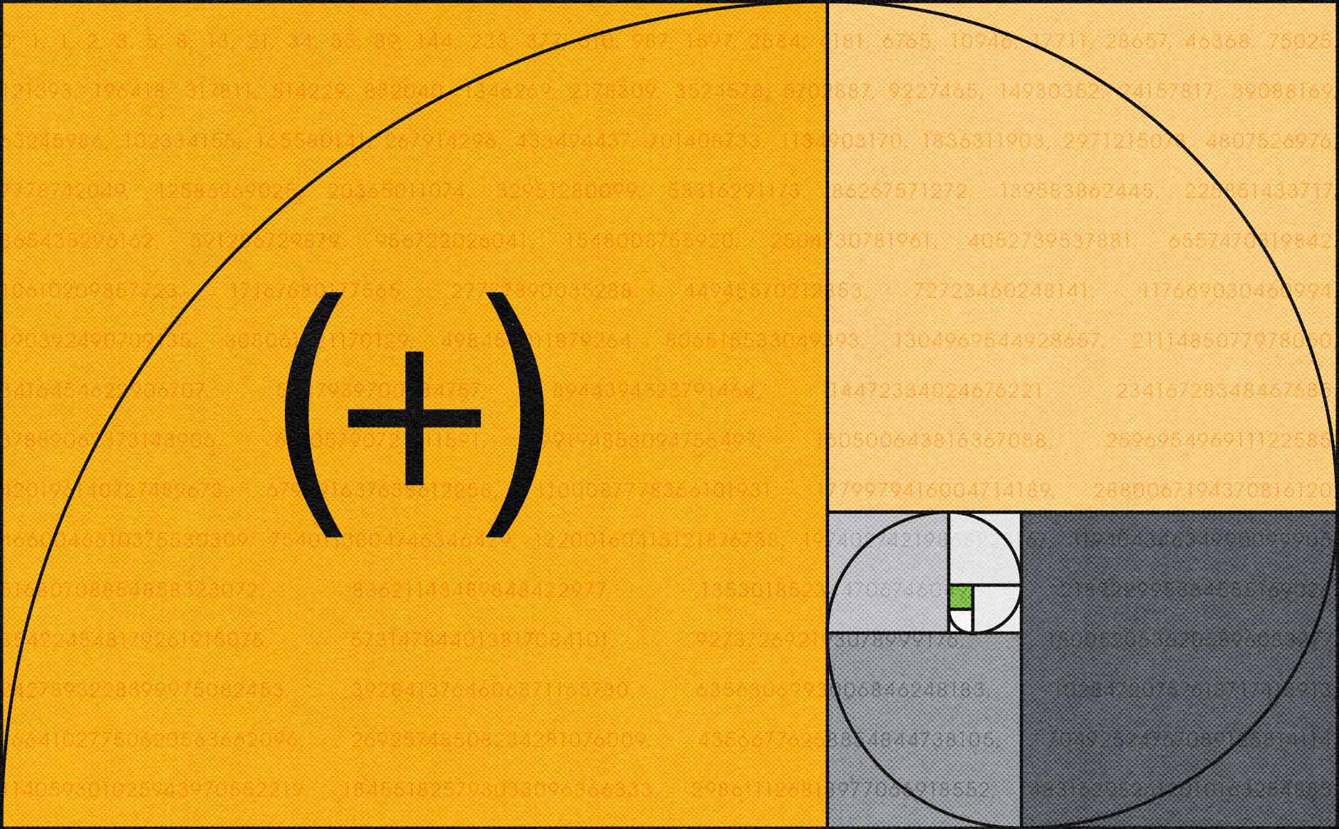
The Fibonacci sequence is often used in design to create balance, proportion, and symmetry, all of which contribute to a more visually pleasing experience. The Golden Ratio is derived from the sequence and when applied to visuals, creates a spiral pattern that is broken into sections of steadily increasing scale, an example of which is the header image of this blog.
The Golden Ratio is frequently used to analyze or influence the proportions of objects and designs and is believed by some in the creative community to make the most beautiful shapes. The ratio is approximately 1:1.618 and is considered to be aesthetically pleasing to the human eye. It creates a natural progression of visual elements, with each element leading to the next in a logical and intuitive way.
How does it apply to our work?
By understanding the Fibonacci sequence’s application and functionality, our team has a blueprint to use when creating visually engaging and balanced work. Beyond design, the principle can be applied to web development and even project management. Here are just a few ways we utilize it.
Composition
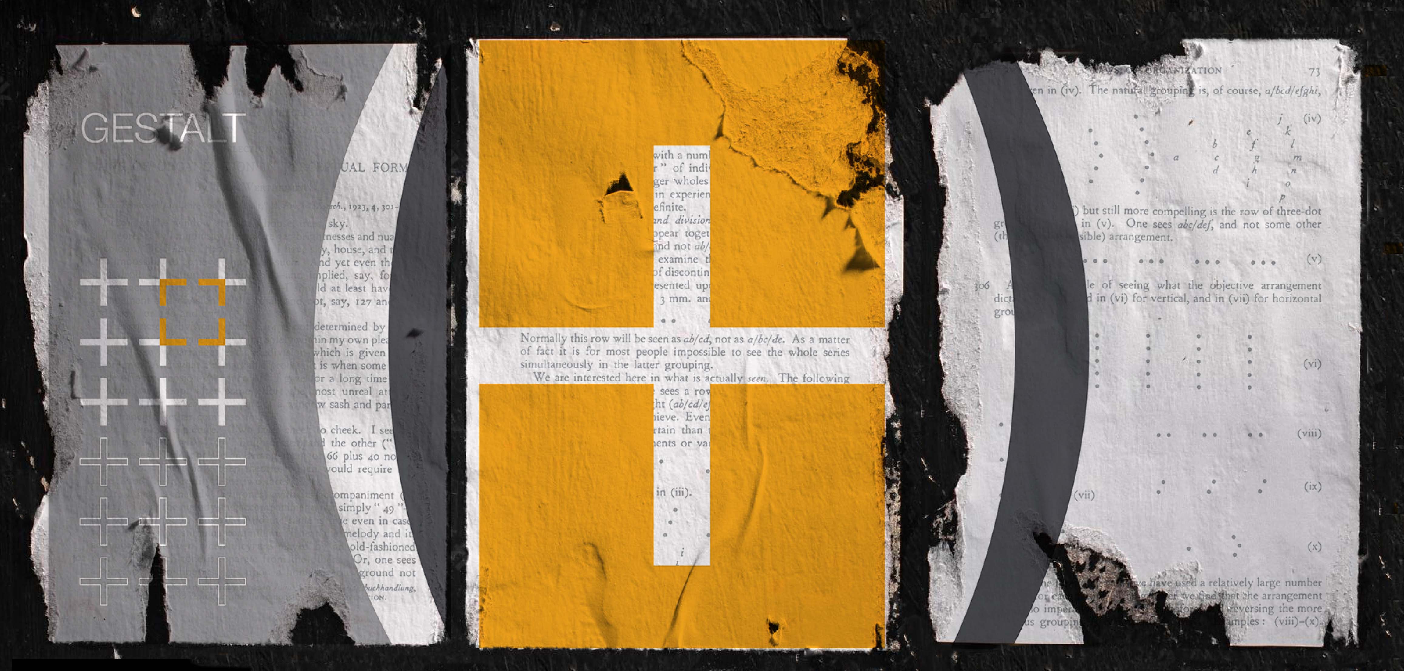
Good visual composition often includes elements of the sequence. Within print layouts, the sequence can help determine the way text and images are scaled and placed on a page, their proximity to one another, and the most appropriate margin sizing.
User Experience
UX design can use the Golden Ratio to create visually appealing interfaces and page layouts that are easy to navigate. It aids in the creation of a visual hierarchy, which can help guide a user's attention and create a sense of order. The ratio can also be used to determine the padding and spacing to give webpages breathability.
Typography
When designers are developing a typeface or working within an established one, the sequence can be used to develop scale, spacing, and proportions. It also informs the type hierarchy for header and subheader sizing, which impacts how users process information.
Scalability
Beyond size, the Fibonacci sequence can also inform the level of effort required. When applied to the amount of work and resources needed for projects, the sequence can be used by project managers to scale the level of effort or difficulty for a team to fix a problem or complete a project. This especially helps with sprint and release planning.
Logos
The sequence can be used to determine the proportions of various elements within a logo and help shape the logo to direct a viewer’s eye. For example, the ratio of the width of the logo in comparison to the height can be based on the increases in the numerical pattern.
The importance of the Fibonacci sequence in the natural world is a fascinating relationship that hints at a deeper underlying order. Exploring this gives us an understanding and appreciation for the connection between mathematics and design, while also elevating our work across the board.


