How Gestalt principles influence the brain and elevate design
Have you ever wondered how your brain understands and organizes what you’re seeing?
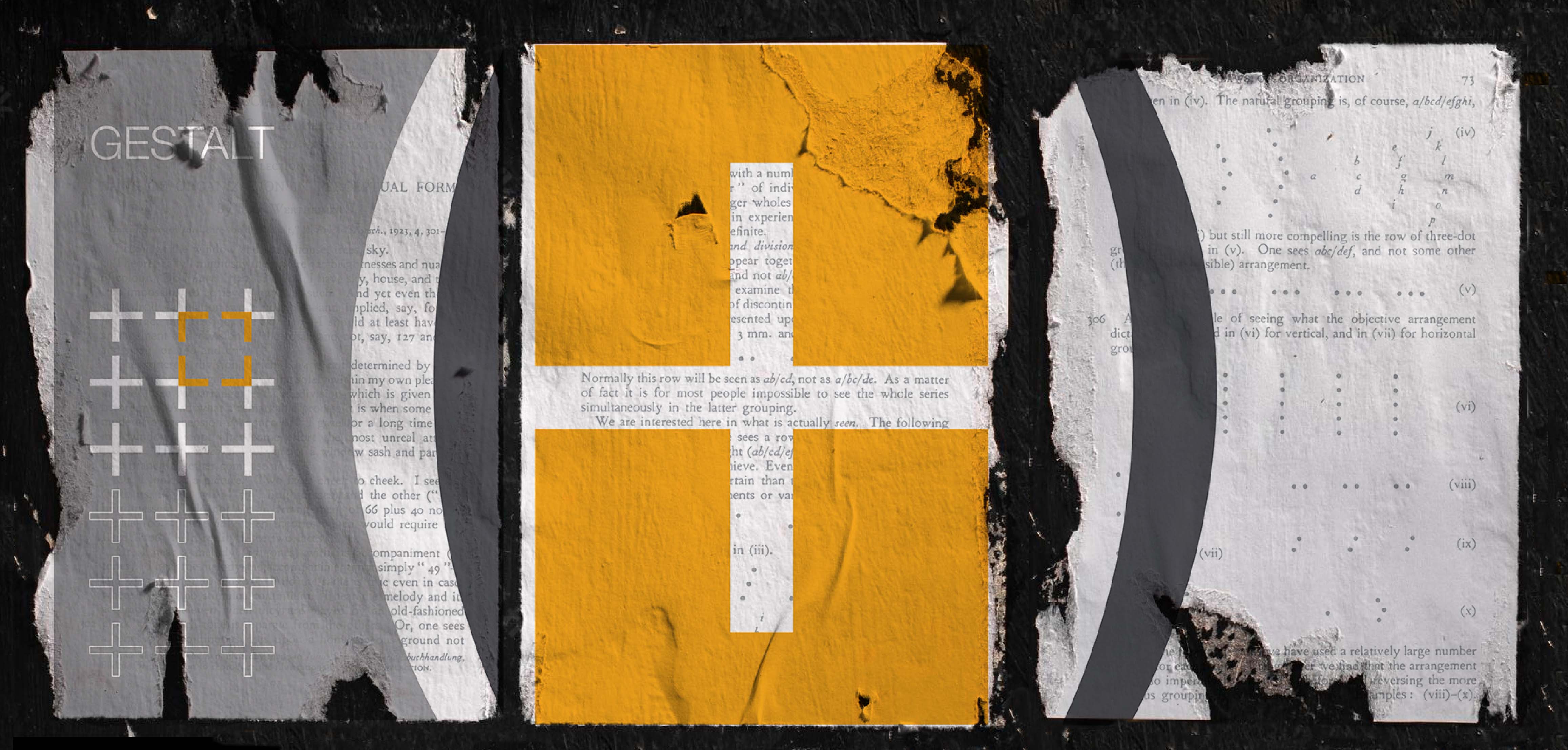
The Gestalt principles explain the psychology of how the brain perceives visual information. These theories attempt to describe how people tend to organize visual elements into groups by applying certain principles. They are an essential part of visual design and inform a number of areas within it.
The first principles were devised in the 1920s by several German psychologists who were looking to understand the ways humans gain meaningful perceptions from the world around them. From there, professionals in the graphic design industry quickly started to apply these principles to their work and have since used them extensively.
“The whole is other than the sum of the parts.” - Kurt Koffka
Naturally, our brains look for patterns and logic to speed up our interpretation of what we’re seeing. Elements such as white space, patterns and proportion shape our perception of what is happening.
Designers use the Gestalt principles to create easy-to-understand visuals that better deliver and communicate the intended message. Correctly executed, they allow the viewer’s brain to digest information in the right order with the right intent in a simple, succinct way.
In fact, you’re using a Gestalt principle right now to read this blog. The principle of proximity explains how humans group objects when they’re close together. Letters are attached to each other with certain spacing that allows the brain to interpret them as words, which create sentences, which make up paragraphs. The spacing between each allows us to read these in the correct order rather than seeing a jumble of letters that run together.
Applying Gestalt psychology to our work
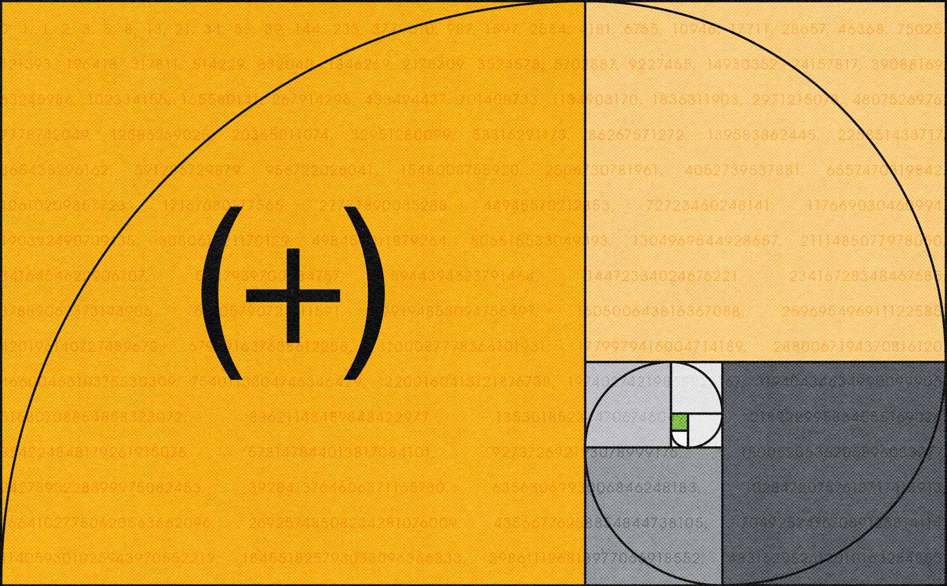
Depending on who you ask, there are a varying number of principles associated with Gestalt psychology. As part of our (add)ventures Creative Curriculum, we chose to focus on seven we felt were most relevant to our work – simplicity, similarity, continuity, closure, proximity, figure/ground and symmetry.
1. Simplicity
We see the simplest shape first, like the whole before its parts.
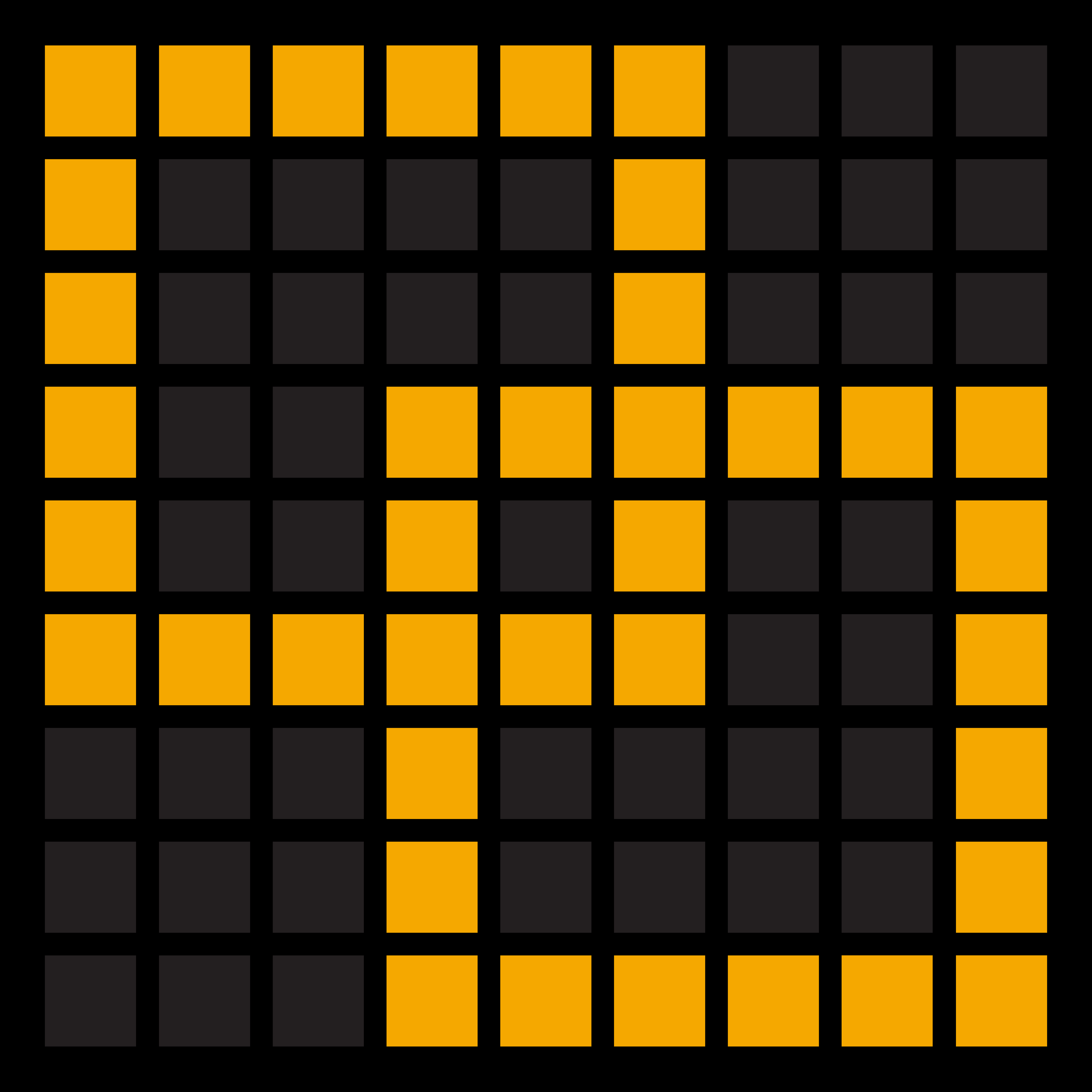
1. Simplicity
We see the simplest shape first, like the whole before its parts.
2. Similarity
We see objects with similar characteristics as being part of the same group.
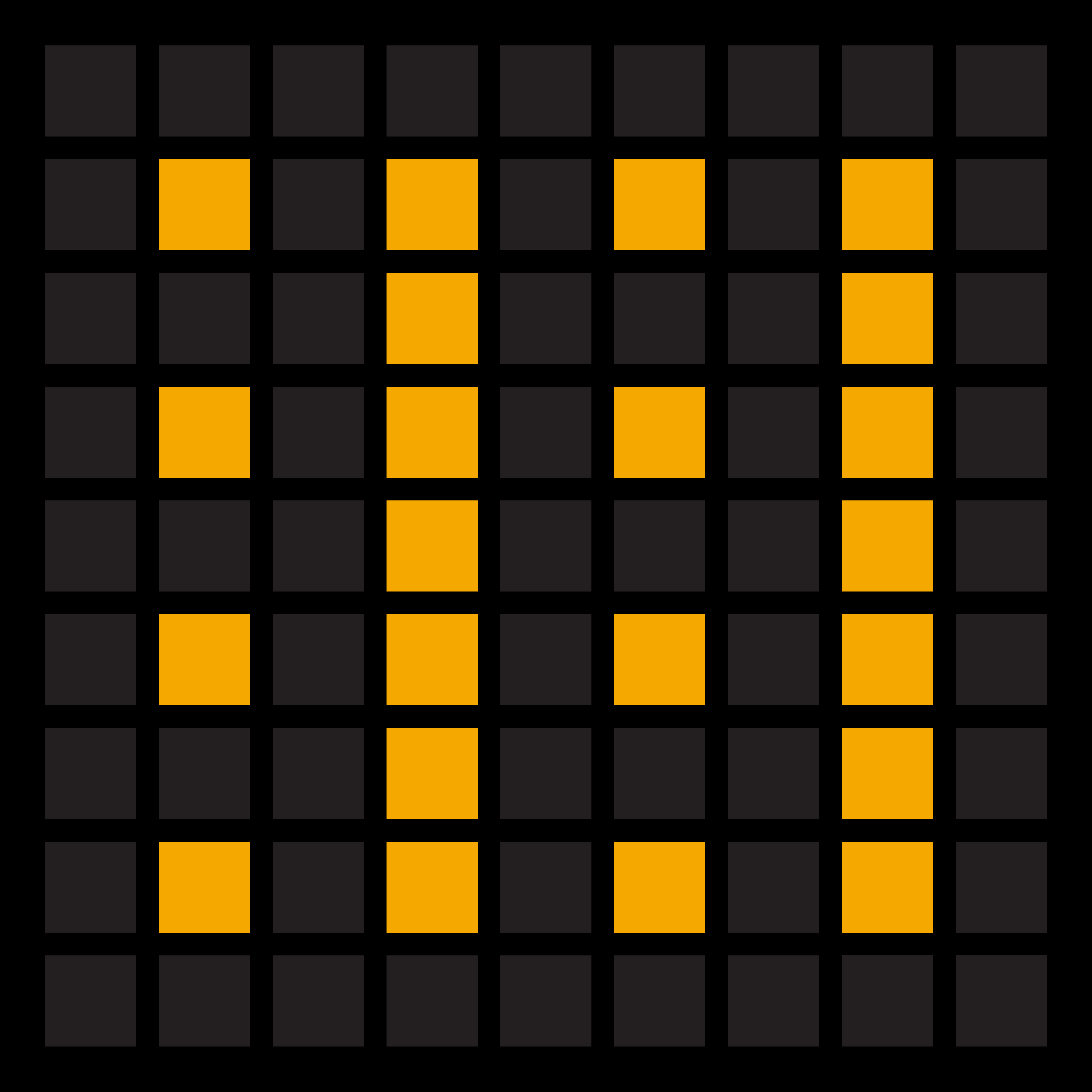
2. Similarity
We see objects with similar characteristics as being part of the same group.
3. Continuity
We follow objects when they are arranged on a continuous path.
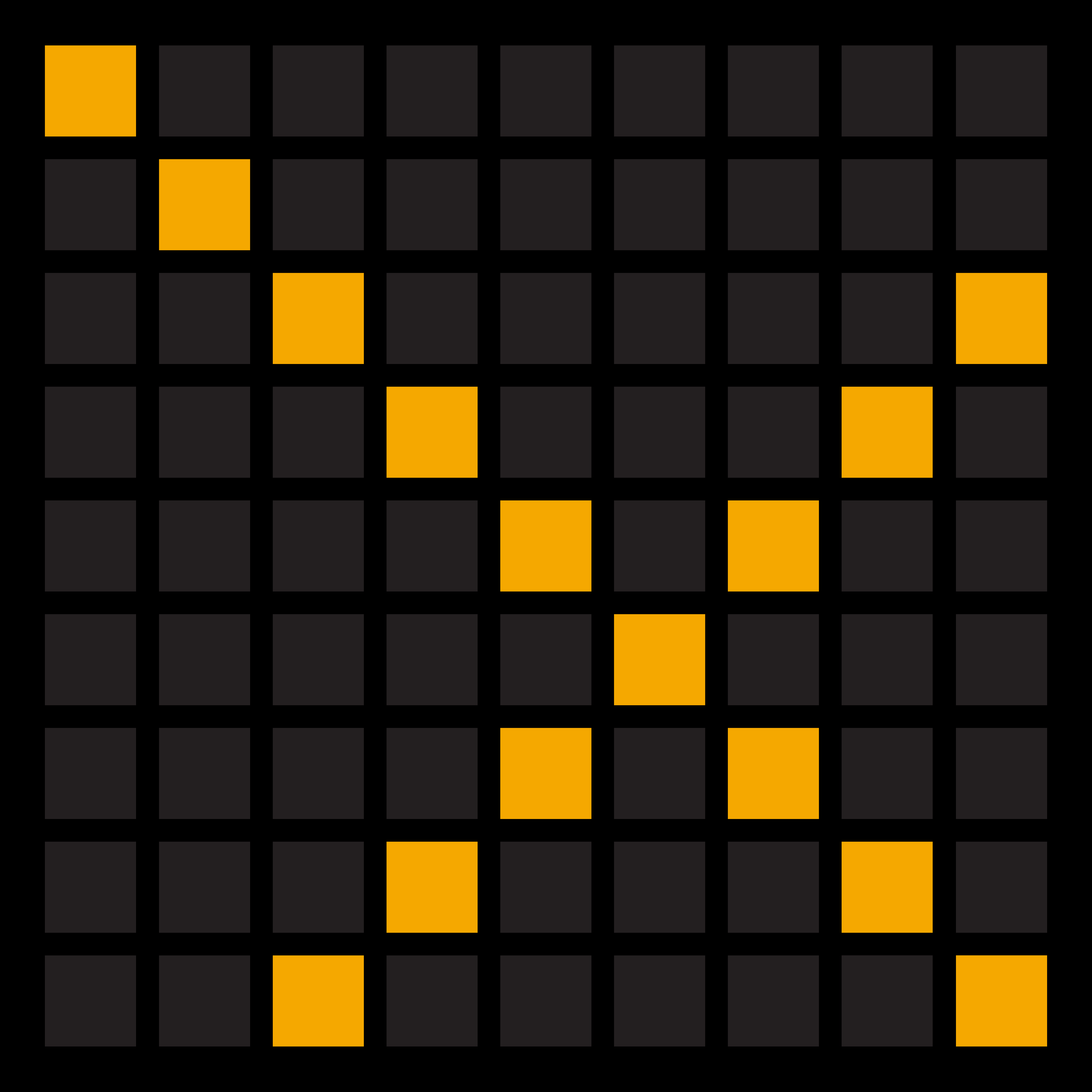
3. Continuity
We follow objects when they are arranged on a continuous path.
4. Closure
We fill in the missing parts to make a familiar form.
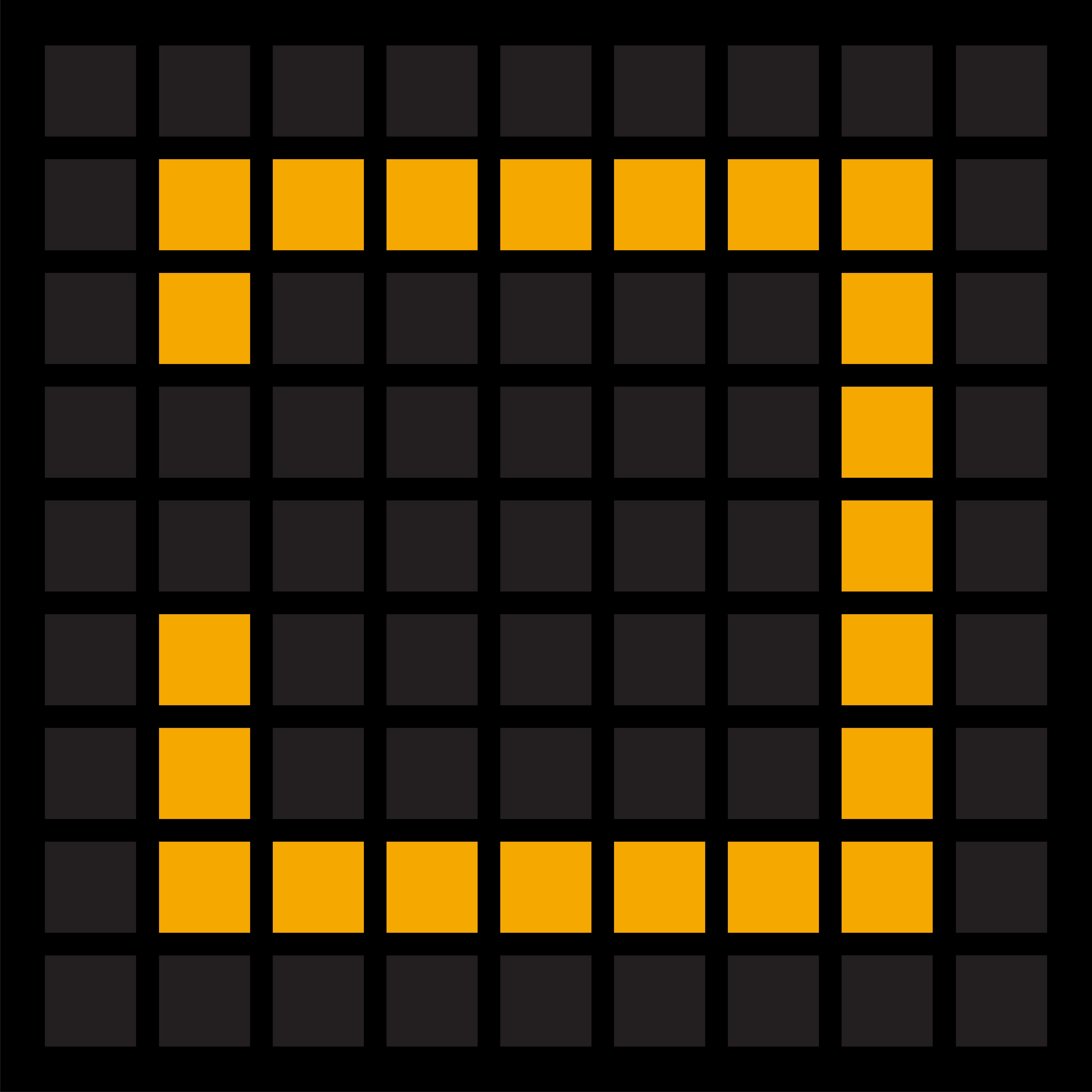
4. Closure
We fill in the missing parts to make a familiar form.
5. Proximity
We see objects as related when they are placed closer together.
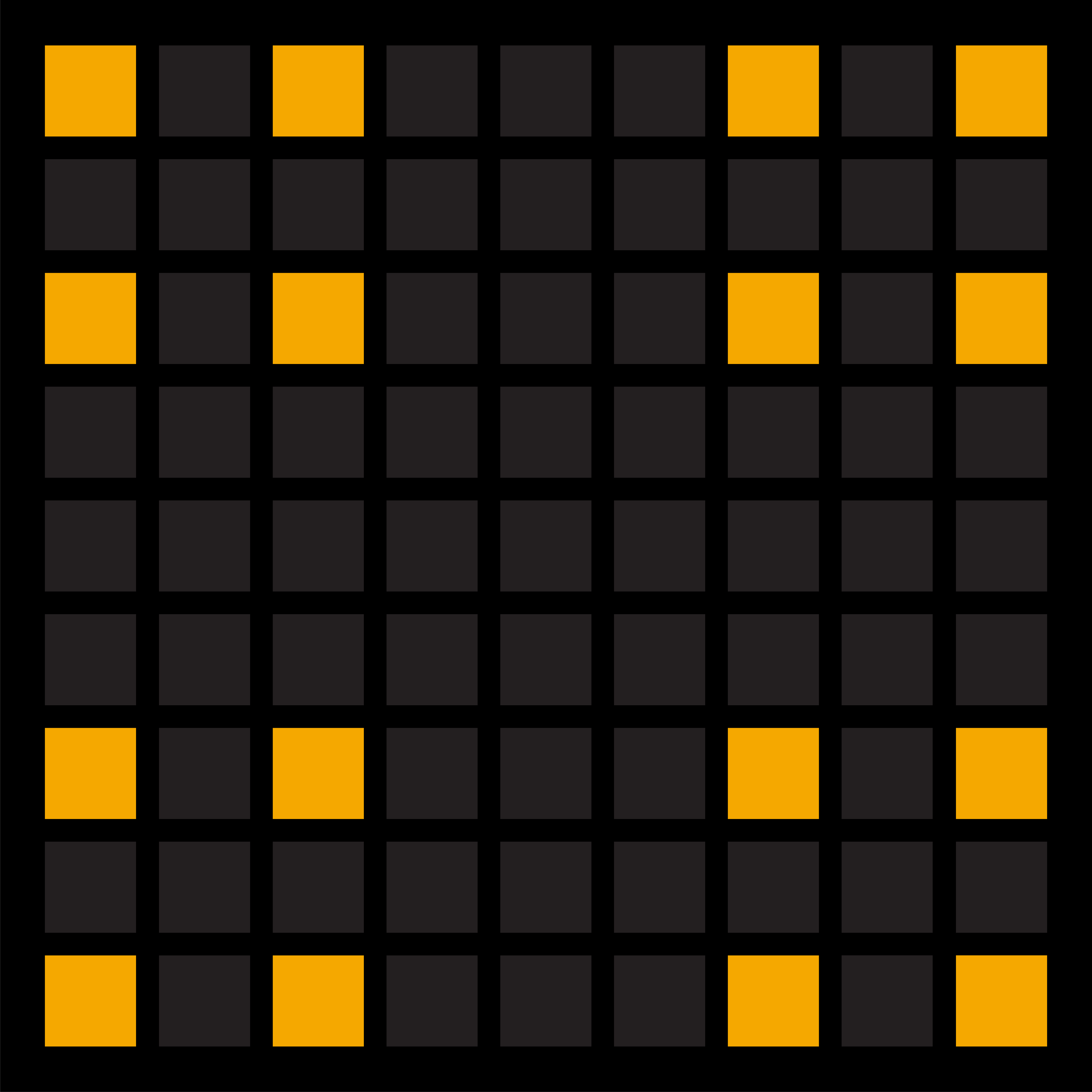
5. Proximity
We see objects as related when they are placed closer together.
6. Figure/Ground
We see forms emerge through the active use of positive and negative space.
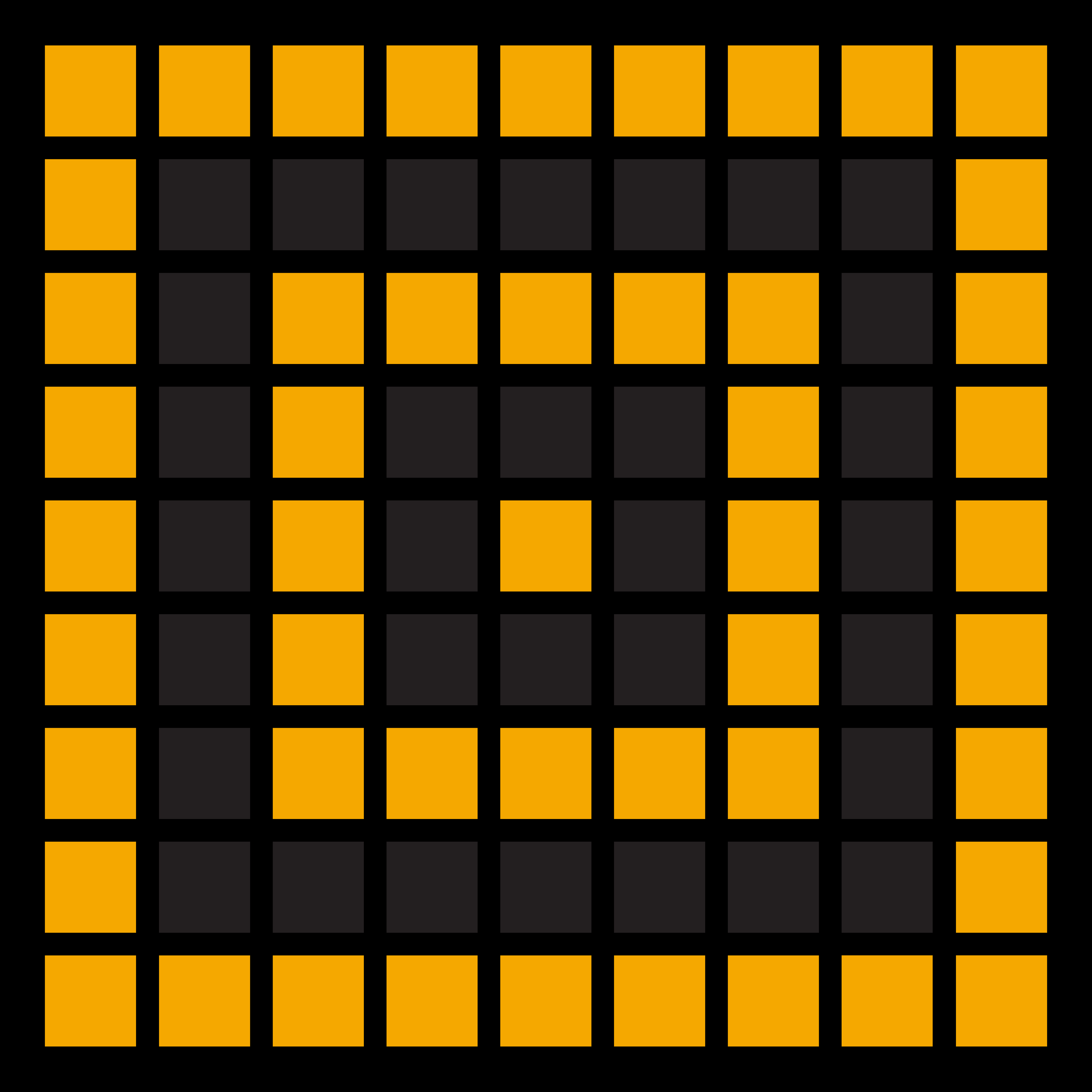
6. Figure/Ground
We see forms emerge through the active use of positive and negative space.
7. Symmetry
We perceive objects arranged symmetrically as part of the same group.
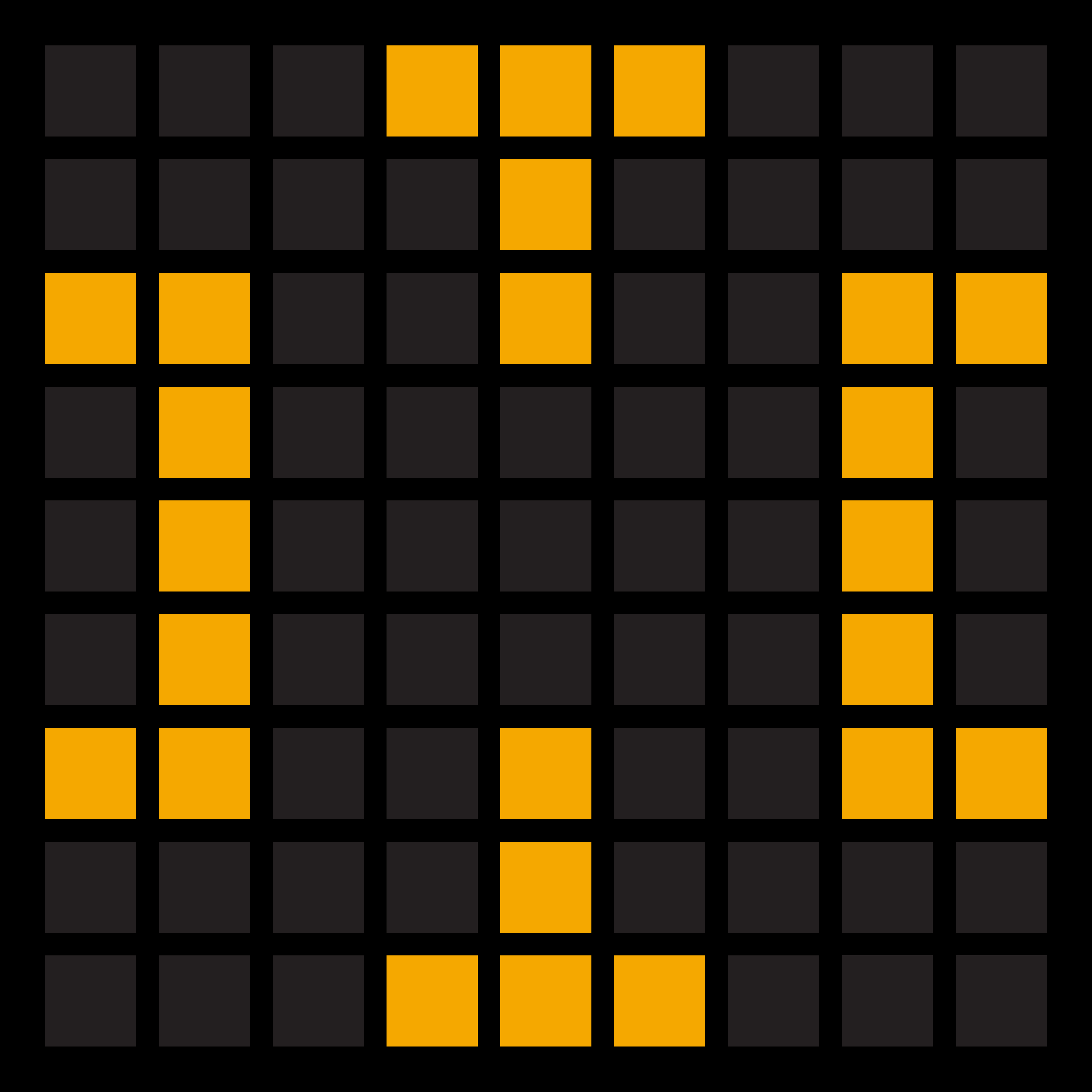
7. Symmetry
We perceive objects arranged symmetrically as part of the same group.
